Etoys Club
...and we keep things moving...
One of the interesting things about this project is that at once I want it to be largely understandable even without the words on it, while also being just generally eye-pleasing and playful feeling. Having a discussion with my lady this evening, I realized that I just plain don't like general magazine approach in the western cultures. Largely, white space is seen as 'bold' and 'attractive', but what my eyeball really drags my brain to is the feeling of discovery, the look of organization and forethought and makes words only PART of the entire experience. I do love me some good typesetting, but when it comes to communication, especially at-a-glance communication, I think the 'less is more' approach really ends up being, to me, less really is less.
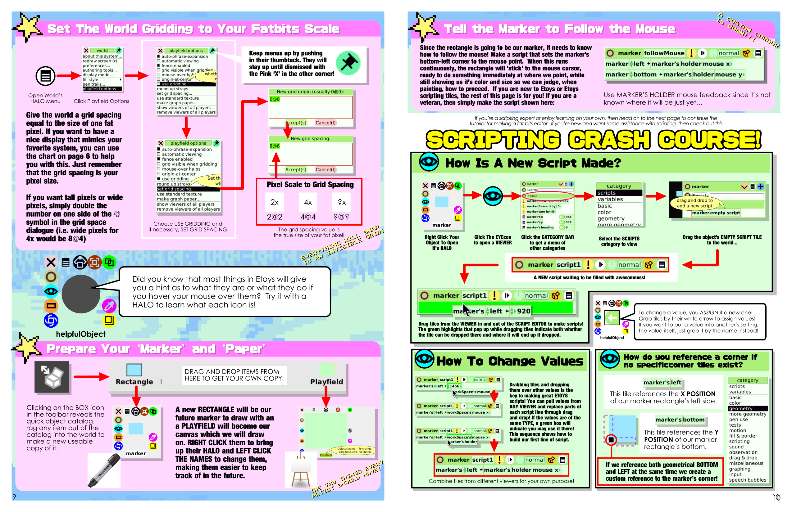
Here's a spread I worked on today. Colors have been used to categorize the elements within the article/tutorial. These colors are uniform throughout the entire book, used for chapter finding, and then within each chapter visually signifying when the chapter itself is 'taking a break' to make sure everyone is up to speed.
I'm not done for the evening, but took a break to make sure the update for the day makes it up to itch.io. Stay tuned, this project is moving along quite nicely, even with the problems of 'storytelling' that find their way into the creation of this material. What is straight forward and boring with language becomes a different beast altogether if your goal is to visually say the same things...
Leave a comment
Log in with itch.io to leave a comment.